

DANKETSU
Undergrad project focused on analyzing an existing company’s financial performance and asks how design can attract the interest of potential investors through brand positioning, logo design, and data visualization.
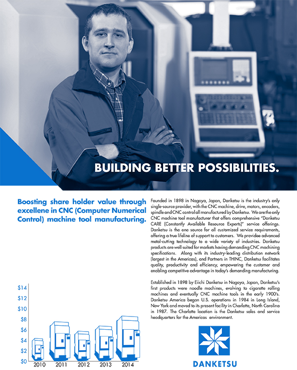
I selected the Japanese CNC machine tools manufacturer OKUMA, renaming it Danketsu (“Unity“). I used the geometric sans-serif Futura and justify it to establish sleek, machine-like typographic syntax. The vibrant blue of Pantone 285 C is used based on its associations with corporate strength and dependability. While the image running across the top of the performance document offers a pleasing human contrast to the precision and coldness of the layout, it is cut into to reinforce the precision/cutting motifs featured in the logo, thus creating more consistency. Changes were made to the subhead, graph, and text layout to increase readability in response to suggestions given during critique.